Overview
One of Prologue: Go Wayback!’s design pillars was to keep UI to a minimum and encourage players to interact with the world itself. However, Prologue contains many interconnected systems. Weather, temperature, wetness, hunger, thirst, and exhaustion constantly affect the player’s chances of survival.
The challenge was finding a balance between readability and immersion. How do you help players understand what is happening without turning the game into a collection of gauges and menus?
Throughout development, we learned that reducing UI and improving immersion are not necessarily the same thing. In many cases, players were not struggling because the game was difficult. They were struggling because they lacked access to the information needed to understand what was happening.
Information Already Exists
The initial approach was to rely as much as possible on information already present in the world.
The environment communicates a surprising amount of information to the player:
- Weather through clouds, rain, snow, fog, and wind.
- Terrain through elevation, biomes, mud, rivers, and forests.
- Item states through visual feedback such as wetness.
The character also communicates information:
- Breathing.
- Shivering.
- Movement speed.
- Various reactions to environmental conditions.
In theory, players could use these signals to understand their situation and make decisions. The challenge was that understanding these signals requires knowledge, attention, and interpretation. Different players have different mental models, different real-world experiences, and different levels of familiarity with survival games.
What seemed obvious to one player could be completely invisible to another.

It is impossible to tell the character’s state without any kind of feedback.
Image courtesy of PLAYERUNKNOWN Productions
The Limits of a No-UI Approach
As playtesting expanded, it became clear that a purely diegetic approach had limits. Very few players understood all the feedback available to them. Some players ignored certain types of feedback entirely. Others misunderstood what the game was trying to communicate.
For example, the character suffering from hypothermia would shake, react differently to the environment, and recover temperature more slowly. While all of this information technically existed, many players simply concluded that they were just cold. The underlying condition remained invisible.
The same problem appeared throughout the game. Players would ask:
- Why am I losing temperature so quickly?
- Why am I warming up so slowly?
- Why did I die?
- Why is the wood not catching fire?
- Is my food cooking?
The information existed somewhere in the game, but it was not accessible enough to support decision-making. At some point, we realized that information existing is not the same thing as information being available.
Making Information Accessible
Rather than exposing every system permanently through UI, I focused on making important information accessible when players needed it. This led me to rethink the hierarchy of information in the game.
Information that directly affected player survival needed to be easy to understand and easy to access:
- Character vitals and increase/decrease rate
- Character conditions such as hypothermia or poisoning.
- Item states such as wetness, liquid level, battery level…
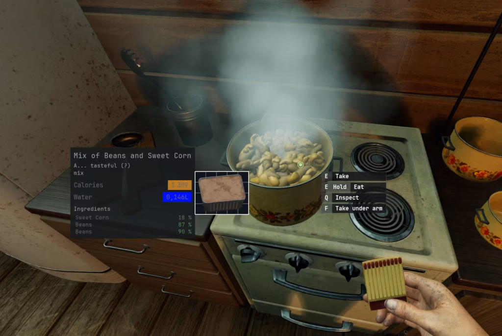
- Cooking progress.
- Survival vitals.
Player’s character vitals
The initial goal was to complement the environmental feedback. It quickly became clear, however, that players needed a precise, reliable primary source of information, available at all times.
Looking specifically at temperature, we were already communicating what we believed was a significant amount of feedback: audio cues, shivering animations, and even progressive frostbite appearing on the character’s hands. In practice, this mostly helped players understand extremes. They could tell when they were safe and when they were about to die, but not much in between.
Based on player expectations from other survival games, I added a temperature gauge, along with two additional pieces of feedback to reinforce temperature changes. Three arrows communicated the rate at which the temperature was increasing or decreasing, while a subtle glow reinforced the feeling of getting warmer or colder.

What surprised me was how quickly the gauge disappeared into the background once it was implemented in a minimalist way. Players did not spend their time staring at it. Instead, it became part of their peripheral awareness. Most of the time, it went unnoticed until a sudden change made them glance at it to confirm what was happening.
In that regard, it behaves much like a car’s speedometer. The information is always available, but only attracts attention when it becomes relevant. Rather than breaking immersion, it helped players better understand their situation and make more informed decisions.
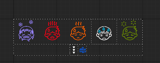
Additional states, such as Hyperthermia, Hypothermia, Wind Chill, Poisoning, and movement penalties, also needed to be visible at all times. Players needed to understand why their character’s condition was changing, not just that it was changing.
Much like a car dashboard, they needed warning lights to explain what was happening. For this reason, I introduced a status bar dedicated to character conditions, allowing players to quickly identify the factors affecting their survival and adjust their decisions accordingly.
Item’s information
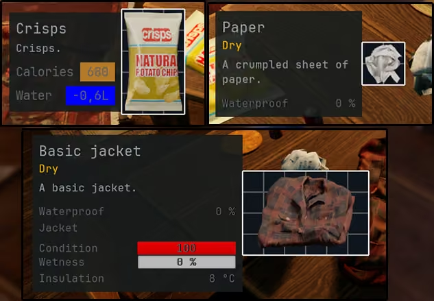
As for the character’s vitals, some item properties had extensive visual feedback to try to communicate their state. While it is working for the burning state, it was absolutely not working for the wet state of an item. Players would be frustrated while trying to light a fire because they would repeat what they learnt and work, but it would suddenly not work anymore. Players needed to understand quickly and clearly if an item was dry or wet, and they would infer the consequences based on their real-world knowledge.
Based on these observations, I designed a contextual inspection window that appears while the player holds a key down on a targeted item. Besides making information accessible when needed, the interaction naturally slowed players down for a moment. This fits well with the intended pace of Prologue, where observation and understanding are as important as action. The way information is accessed influences player behavior just as much as the information itself.
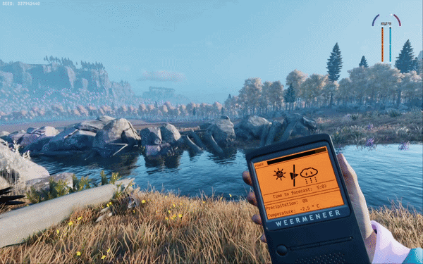
Image courtesy of PLAYERUNKNOWN Productions
Information from the world
As the world of Prologue is also your enemy, giving players unrestricted access to information would make many dangers fully predictable and remove much of the uncertainty that drives the experience. At the same time, relying solely on environmental cues proved challenging for some players.
Interestingly, players reacted very differently to navigation tools such as the map and compass. Some viewed them as unnecessary and preferred to save the inventory space. Others actively sought them out because they were less confident in their ability to navigate using environmental cues alone.
This observation led me to introduce additional world-reading tools, such as a thermometer that could tell players exactly how cold it was, and a weather monitor that could provide humidity levels and weather forecasts. These tools did not remove uncertainty from the game; they transformed vague observations into actionable information.
This approach allowed players to choose how much precision they wanted. Those who enjoyed reading the world could continue doing so, while others could trade inventory space for additional information. It also created meaningful variation between runs, as players could not rely on finding a specific tool every time.
The concept proved popular with the community, and we eventually expanded it with additional items such as the step counter, which became particularly appreciated by speedrunners and roleplay-oriented players.
One principle gradually emerged during development: if players cannot reliably make the correct decision without a piece of information, that information probably needs to be exposed. The question then becomes how players access that information, and what it costs them to do so.
Readability Over Purity
Initially, exposing more information felt like a compromise. It seemed to contradict the original creative direction of minimizing UI and encouraging players to learn through observation.
What we discovered, however, was that players engaged with systems more once they had enough information to understand them. Players experimented more. They solved problems more creatively. Systems that were previously ignored suddenly became valuable tools.
Cooking was a good example. Once players could clearly understand the state of their food and the consequences of their actions, they began using the system more frequently and with greater intention.
This led to an important realization. Part of the game’s difficulty was not coming from the systems themselves, but from the effort required to understand them. Reducing ambiguity did not remove the challenge. It allowed players to engage with the challenge that was already there.
Lessons Learned
One of the advantages of Early Access was the ability to experiment with information presentation and observe how players reacted. One pattern emerged repeatedly: players rarely objected to having access to information.
Players seldom pinpoint what the problem is. For example, many players called the cooking mechanic “useless”. Until we made it clear how to use it and what it does. Players draw quick conclusions based on their experience, and taking a step back often reveals what the problem is and, if you’re lucky, how to fix it.
Once we embraced the idea of giving players as much information as possible, the discussion became about how that information should be exposed, instead of what value it would add by exposing it.
Another lesson was that information redundancy is often necessary. Some players miss visual feedback. Others ignore audio cues. Some simply interpret the same signal differently. Providing multiple ways to access important information made systems easier to understand without making them simpler.
Shifting mindset was not easy, but stepping away from the assumption that making a game without UI helped more players enjoy our game. While this would raise a different kind of challenge, I am siding with giving the player access to information first, and thinking about pruning the information later instead of doing the opposite. Imperfectly presented information is often better than ambiguous/no information. Players can work with information they understand. They struggle to make meaningful decisions when they are forced to guess.
The first comes from Antoine de Saint-Exupéry (being French and a pilot myself, I couldn’t resist!) :
“Perfection is attained not when there is nothing more to add, but when there is nothing more to take away.”
I found this to be true, but only after players could reliably understand and interact with the systems. Before removing information, you first need enough information for players to make informed decisions.
The second is a common game development principle: make it exist first, then make it good. Early Access allowed us to test information presentation with players long before the visuals and UX were finalized. In many cases, simply exposing information was already a major improvement, and we could refine its presentation later.