Overview
One of the creative goals of Prologue: Go Wayback! was to avoid traditional tutorialization and rely as much as possible on player discovery.
This immediately created a challenge. Survival games contain many interconnected systems, and players need to understand how to interact with them in order to survive.
We didn’t want to teach the players; we wanted them to understand the rules of the world enough so they could teach themselves.
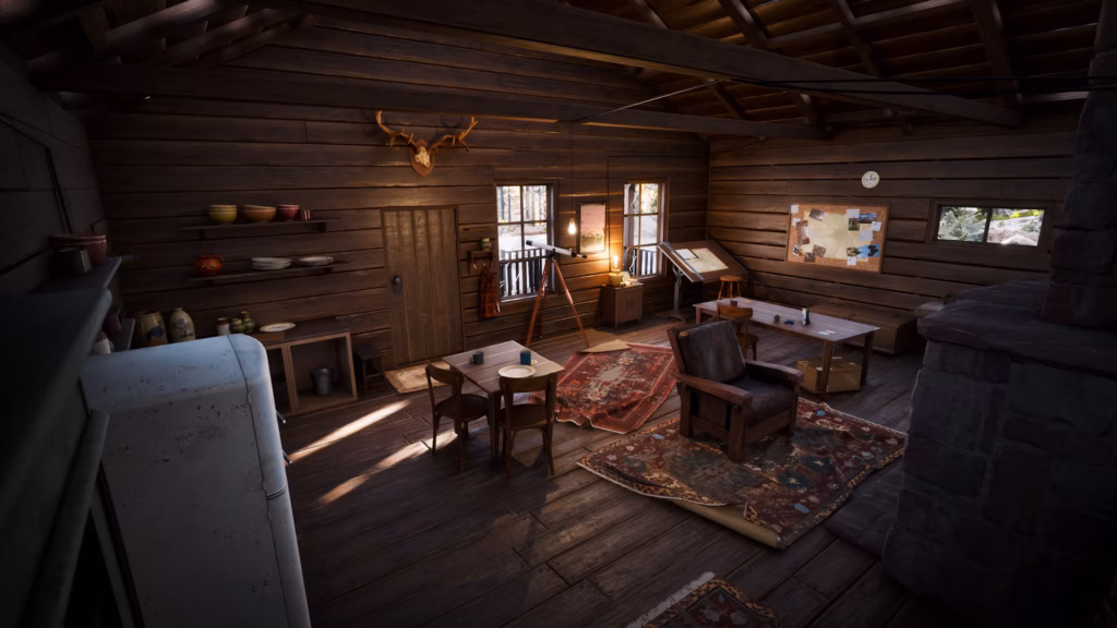
Image courtesy of PLAYERUNKNOWN Productions
The Initial Problem
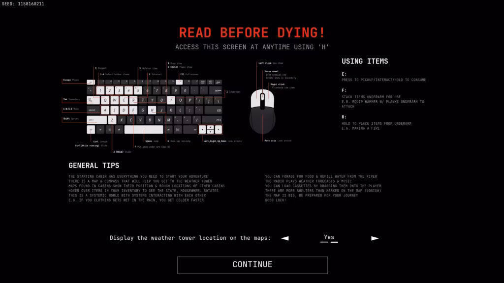
Early versions of the game relied heavily on printed controls and explanations. Players often needed external information to understand how to interact with the world. While this allowed them to play the game, it was not aligned with the intended experience.
A player should ideally learn by interacting with the world itself, not by reading instructions (or through a forced tutorial). As development progressed, it became clear that we needed a framework for deciding what information should be communicated through the world, through controls, and through UI.
Reframing the Game as an Immersive Simulation
One of the most useful mental shifts was internally treating Prologue as an immersive simulation. Instead of asking “How do we explain this mechanic?” we explored mental models, “What would a player reasonably expect to happen?”
This changed how we approached many design problems. When a system behaved consistently with a player’s mental model, less explanation was required. When a system contradicts player expectations, no amount of tutorialization cancompletely solve the confusion.
Thanks to our community on Discord, I could interact with players, and because they were passionate about the game, they were vocal about how they expected systems to behave. This allowed us to test our design in the real world, where players would compare our systems and interactions to existing survival game ones. Strong reactions helped us prioritize redesigning some of our systems.
Building on Mental Models and Affordances
Players arrive with existing knowledge not only from other survival games, but from the real world.
They know that:
- Matches start fires.
- Food can be eaten.
- Shelters protect from bad weather.
Whenever possible, we tried to build on these expectations rather than introduce entirely new concepts. This philosophy also influenced item design. Items were regularly reviewed and adjusted to ensure their appearance, behavior, and interactions matched what players expected from them. The closer an object is aligned with its affordances, the less explanation it requires.
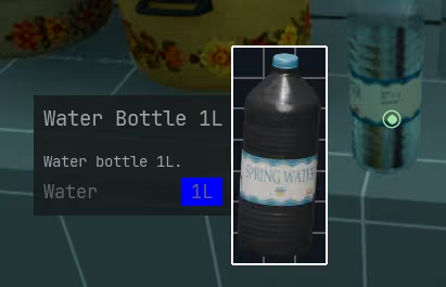
It was simply impossible to understand if an item might fit in a backpack. Once the pop-up was created, it served as a basis to display more information about items.
Understanding Information Accessibility
One of the most important lessons was that information existing somewhere is not the same as information being accessible. For example, item inspection was initially only available through the inventory.
Technically, the information existed. Practically, players inspect items constantly, and opening the inventory every few seconds to identify a can of tuna quickly became frustrating. The effort required to access it was simply too much for intensive use of the feature.
Many design decisions throughout development focused on reducing this friction and making important information available at the moment players needed it while respecting design pillars, so that Prologue wouldn’t become a game where players spend more time looking at UI than exploring the world.
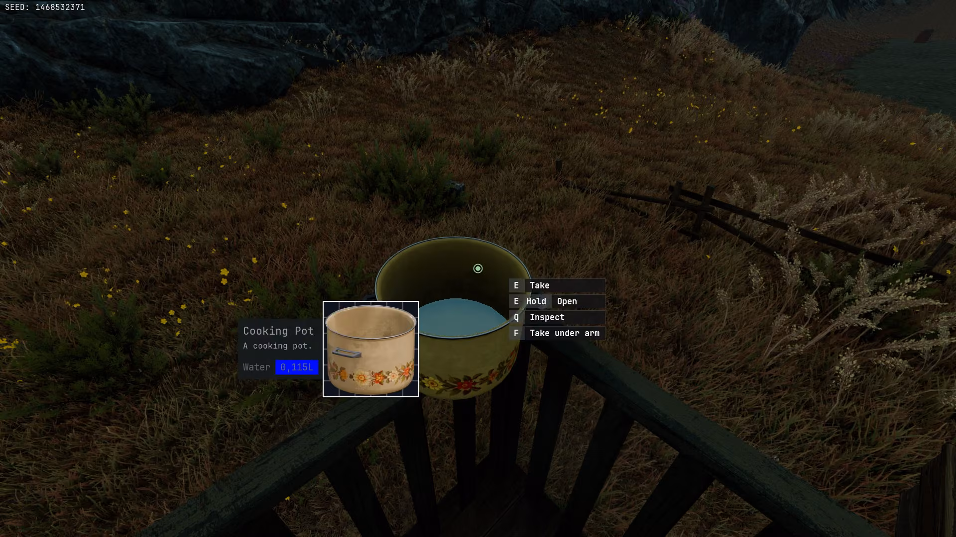
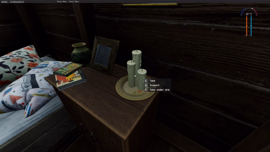
Making Interactions Predictable
Input prompts became one of the primary tools for communicating available interactions in the game. Rather than displaying every possible interaction at all times, prompts were organized according to context, like in immersive simulations.
Here’s the hierarchy I defined for Prologue. This structure helped create consistency across the entire game and allowed players to build intuition over time:
- World Interaction
- The center of the screen communicated interactions with objects in the world (as opposed to equipped or carried items).
- Equipped Item Interaction
- The bottom right side of the screen communicated interactions related to the equipped item.
- These prompts were generally reserved for situations where the interaction was not obvious or where multiple actions were available.
- Additional Actions
- The left side of the screen communicated secondary actions and additional features.
- The left side of the screen communicated secondary actions and additional features.
Image courtesy of PLAYERUNKNOWN Productions
Lessons Learned
There were 2 main challenges:
- Understanding what players could reasonably infer from the world and what information needs to be communicated explicitly.
- Understanding how game design conventions (from established survival games) are preventing players from using their real-world mental model.
As an example, making fire in the world is relatively common knowledge. Use an ignition source on something that catches fire quickly, and use it to burn a better fuel that catches fire slowly. However, many games remove the middle step entirely, simplifying the mental model players have when they want to make a fire in a game to “Ignition source = fire”.
Mental models, affordances, and consistency allowed us to reduce the amount of information shown to the player, but they could not completely replace communication.
The most important lesson was that readability is not about whether information exists. It is about how quickly and naturally a player can access that information when they need it.
In an immersive experience, reducing friction is often more important than reducing UI. In fact, once we realized this, we shifted our design philosophy from “Should we expose this information?” to “How do we make this information easily accessible?”